* feat: integrate supabase auth service * chore: ignore the sercet * feat: separate and inject the auth service * chore: integrate auth service into sign in/up page * feat: integrate github and google sign in * chore: update user trait * feat: box any params in UserCloudService trait * feat: add flowy-server crate * refactor: user trait * docs: doc ThirdPartyAuthPB * feat: server provider * feat: pass the uuid to rust side * feat: pass supabase config to rust side * feat: integrate env file * feat: implement login as guest * feat: impl postgrest * test: use env * chore: upper case key * feat: optimize the file storage * fix: don't call set auth when user login in local * docs: add docs * feat: create/update/get user using postgrest * feat: optimize the login as guest * feat: create user workspace * feat: create user default workspace * feat: redesign the setting path location page * feat: use uuid as view id * feat: send auth info to rust backend * fix: sign up * fix: skip to wrong page after login * fix: integrate test error * fix: indent command error * feat: add discord login in type * fix: flutter analyze * ci: fix rust tests * ci: fix tauri build * ci: fix tauri build --------- Co-authored-by: nathan <nathan@appflowy.io> |
||
|---|---|---|
| .. | ||
| example | ||
| lib | ||
| test | ||
| .gitignore | ||
| .metadata | ||
| analysis_options.yaml | ||
| CHANGELOG.md | ||
| LICENSE | ||
| pubspec.yaml | ||
| README.md | ||
| screenshot.png | ||
AppFlowy Popover
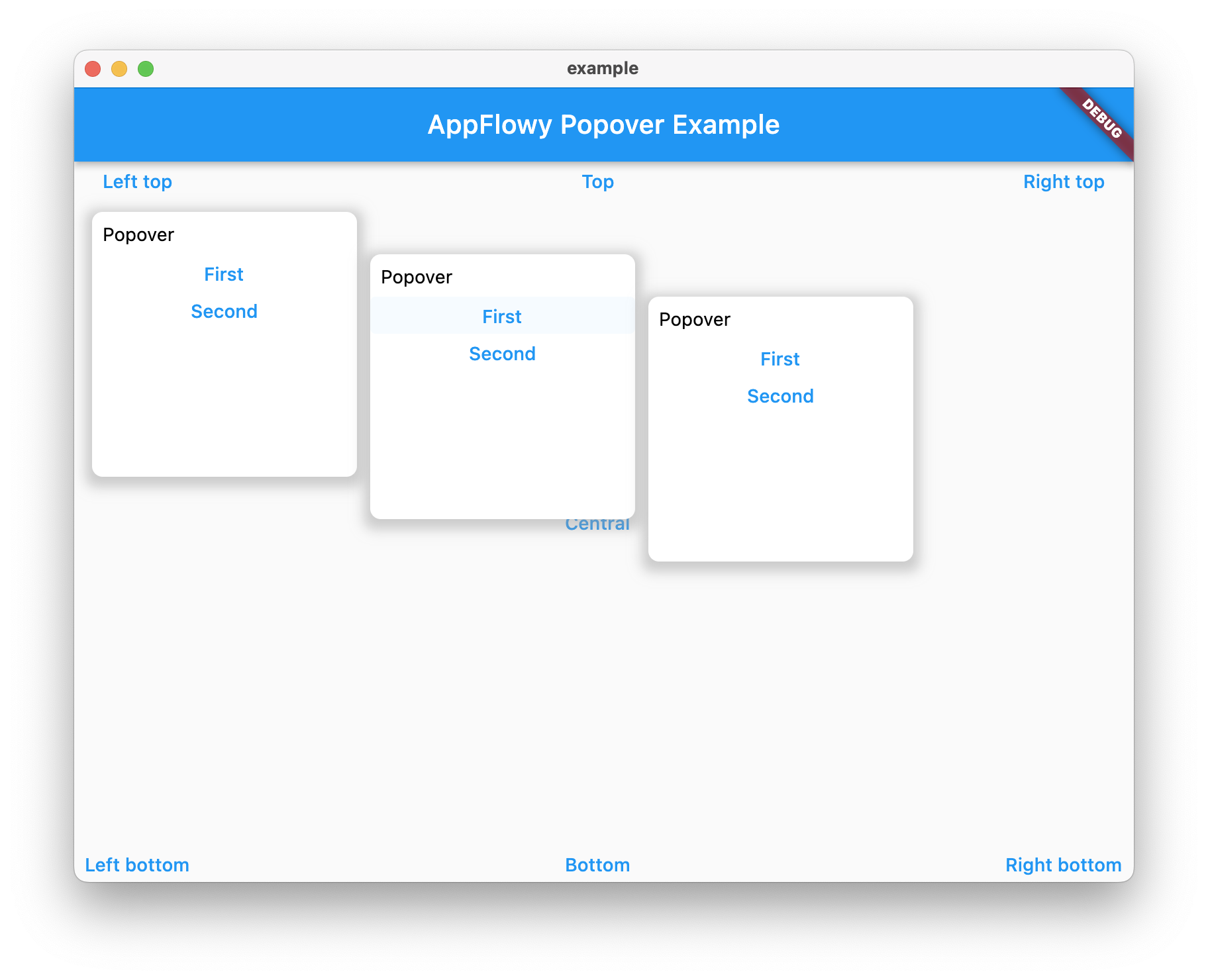
A Popover can be used to display some content on top of another.
It can be used to display a dropdown menu.
A popover is a transient view that appears above other content onscreen when you tap a control or in an area. Typically, a popover includes an arrow pointing to the location from which it emerged. Popovers can be nonmodal or modal. A nonmodal popover is dismissed by tapping another part of the screen or a button on the popover. A modal popover is dismissed by tapping a Cancel or other button on the popover.
Source: Human Interface Guidelines.
Features
- Basic popover style
- Follow the target automatically
- Nested popover support
- Exclusive API
Example
Popover(
  // Define how to trigger the popover
  triggerActions: PopoverTriggerActionFlags.click,
  child: TextButton(child: Text("Popover"), onPressed: () {}),
  // Define the direction of the popover
  direction: PopoverDirection.bottomWithLeftAligned,
  popupBuilder(BuildContext context) {
    return PopoverMenu();
  },
);
Trigger the popover manually
Sometimes, if you want to trigger the popover manually, you can use a PopoverController.
class MyWidgetState extends State<GridDateCell> {
  late PopoverController _popover;

  @override
  void initState() {
    _popover = PopoverController();
    super.initState();
  }

  // triggered by another widget
  _onClick() {
    _popover.show();
  }

  @override
  Widget build(BuildContext context) {
    return Popover(
      controller: _popover,
      ...
    )
  }
}
Make several popovers exclusive
The popover has a mechanism to make sure there are only one popover is shown in a group of popovers.
It's called PopoverMutex.
If you pass the same mutex object to the popovers, there will be only one popover is triggered.
class MyWidgetState extends State<GridDateCell> {
  final _popoverMutex = PopoverMutex();

  @override
  Widget build(BuildContext context) {
    return Row(
      children: [
        Popover(
          mutex: _popoverMutex,
          ...
        ),
        Popover(
          mutex: _popoverMutex,
          ...
        ),
        Popover(
          mutex: _popoverMutex,
          ...
        ),
      ]
    )
  }
}
API
| Param | Description | Type |
|---|---|---|
| offset | The offset between the popover and the child | Offset |
| popupBuilder | The function used to build the popover | Widget Function(BuildContext context) |
| triggerActions | Define the actions about how to trigger the popover | int |
| mutex | If multiple popovers are exclusive, pass the same mutex to them. | PopoverMutex |
| direction | The direction where the popover should be placed | PopoverDirection |
| onClose | The callback will be called after the popover is closed | void Function() |
| child | The child to trigger the popover | Widget |
